"Meaningless Distinctiveness": 20 Examples and Their Backstories.
Lions and Nazis and "Mother McDonald's Breasts," Oh My!
What is “Meaningless Distinctiveness?”
Before we get into examples, let’s talk about meaningless distinctiveness—because it’s often misunderstood.
When the Ehrenberg-Bass Institute talks about meaningless distinctiveness, they are referring to distinctive brand assets—logos, colors, mascots, jingles—and names* that stand out precisely because they seem randomly chosen or disconnected from the category.
The goal is to build brands so distinctive no competitor can—or would even think to—copy them. Imitation isn’t always deliberate. Assets that feel unnatural or irrelevant to the category are less likely to be mimicked, even by accident.
*Ehrenberg-Bass doesn’t specifically include names in its discussion of “meaningless distinctiveness,” but the same logic applies.
The issue is that both “meaningless” and “distinctiveness” get twisted (even Jenni Romaniuk of the Institute believes the term “meaningless” falls short).
Meaningless doesn’t mean “no meaning”—it means “no category meaning,” and often no business meaning at all.
Everything has meaning. “Meaningless” here just means no meaning in a market context. For example, apples have no obvious link to tech—even if plenty of people, including Apple themselves, have tried to connect the two after the fact.*
*There are plenty of myths about Apple’s name and logo, but they are all post-rationalization. According to Steve Jobs’ biography, he chose it after visiting an apple orchard while on a fruitarian kick. He liked that it was “fun, spirited, and not intimidating.” That’s it. Apple only made the knowledge connection after picking the name, with their first Isaac Newton logo. Less than a year later, they scrapped it—and never went back to that idea.
Additionally, designers often claim “the logo’s simplicity reflects the product’s simplicity.” In reality, it’s simple because they hired a designer who understood that simple logos work. That’s true across the board—iconic logos tend to be simple, and most logos get simplified over time.
Distinctiveness isn’t differentiation, and it’s not at odds with it.*
Distinctiveness is about unmistakable brand assets—like the Geico Gecko, Lacoste’s crocodile, Wendy’s name/square patties.
Differentiation is about perceived differences (features, benefits, positioning, personality, pricing, etc.)—like Geico’s playfulness, Lacoste’s polo association, Wendy’s “fresh never frozen” line.
While both can contribute significantly to brand growth, distinctiveness has one particular advantage over differentiation. It is legally ownable. Geico owns its gecko, Lacoste its crocodile, and Wendy’s its name. By contrast, Geico’s playfulness used to stand out—now every insurer tries it. Lacoste invented the polo shirt—but today, they’re one of many brands making them. Wendy’s tagline was stolen from KFC.†
Other factors—timing, scale, distribution—matter more than meaningless distinctiveness, and differentiation can drive growth. But brands with some level of meaningless distinctiveness dominate Interbrand’s Top 100 for a reason. It’s durable, memorable, and hard to copy.
Now to the examples.
*Some frame distinctiveness and differentiation as either/or, but meaningless distinctiveness can reinforce any differentiation strategy. Even the “brand love” crowd can’t deny that many of their favorites—Starbucks, Apple, Suburu—lean on meaningless distinctiveness.
†It’s significant that Wendy’s blatantly stole their tagline from KFC because burger chains don’t just compete with other burger chains—they compete with chicken, pizza, and coffee shops too.
Famous Examples of Meaningless Distinctiveness:
1. The Lacoste Crocodile:
In 1923, Lacoste’s tennis star founder René Lacoste bet his coach he could win a crocodile skin suitcase after a Davis Cup match in Boston. Later, a journalist referred to him as “the crocodile.” The symbol stuck.
2. The Coca-Cola Polar Bears:
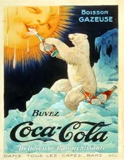
The Coca-Cola Polar Bears were first used in a 1922 French poster of a polar bear giving the sun a cold Coca-Cola. This was likely a strategic choice to emphasize Coke as a cold drink on a hot day. However, throughout the 1990s and into the 2000s, the polar bears shed their original message and took on the meaning of Christmas. The exact opposite of a hot day. Since their transition into a Christmas symbol, there is no link between the iconic polar bears and its category.
3. Coca-Cola’s Bottle Shape:
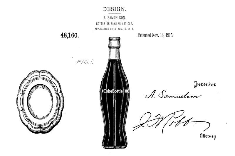
Speaking of Coca-Cola, they have always been at the forefront of distinctiveness for distinctiveness sake. In 1915, they asked bottle manufacturer, The Root Glass Company, to design something “so distinct that you would recognize it by feel in the dark or lying broken on the ground”.
Now that’s a proper design brief in my opinion.
4. The Geico Gecko:
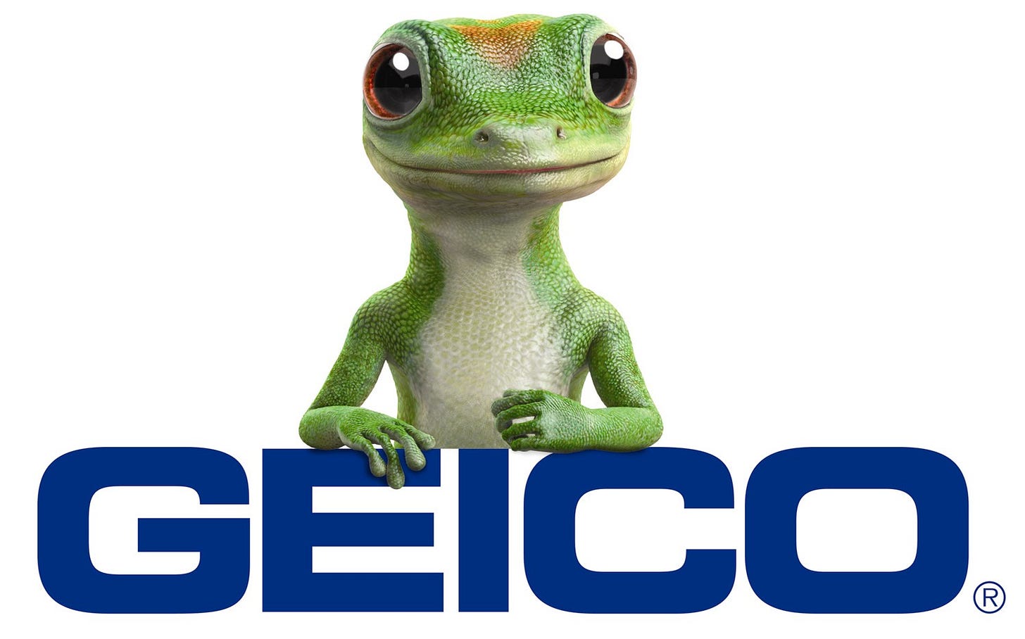
GEICO stands for Government Employees’ Insurance Company. In 1999, the creative team at Martin Agency was hired to create a “mental shortcut” for the brand.
According to Per Neel Williams, SVP and group creative director at Martin, the Geico Gecko wasn’t intended to endure as a distinctive brand asset long-term. It was an idea for a single campaign.
“It was just, ‘Oh, Gecko sounds like Geico.’ The original concept was about the Gecko being annoyed because people kept calling him thinking he was Geico and they were trying to get car insurance.”
Since then, Martin Agency has spent 30 years helping Geico reinforce the gecko. Originally created for car insurance, the mascot’s meaninglessness makes it easy to stretch across products—car, motorcycle, home, even pet insurance.
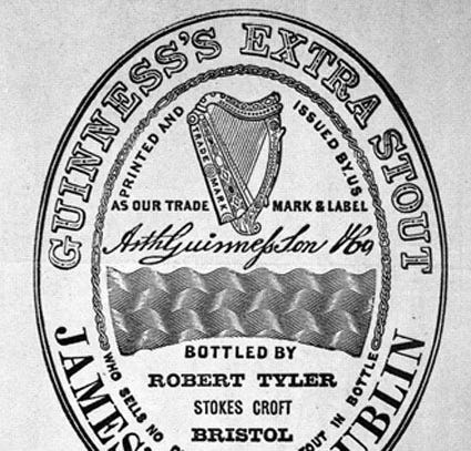
5. The Guinness Harp:
The harp has been a symbol of Ireland since the 13th century. In 1862, Guinness based their logo on a specific 14th century harp called the “Brian Boru Harp” to honor their Irish heritage.
Ironically, the Guinness harp, a symbol steeped in Irish history, now adorns Guinness Blonde American Lager, a testament to the adaptability of brand assets that have become meaningless for most over time.
6. The MGM Lion:
A publicist for Metro Goldwyn Mayer, Howard Dietz, chose the MGM lion as a nod to his alma mater, Columbia University. 6 lions have served as the mascot since 1916.
7. “Jake from State Farm” and the State Farm Sonic Logo:
The original “Jake From State Farm” was a real employee of the company, Jake Stone. Like the GEICO gecko, “Jake From State Farm” was meant to be a one-off character until State Farm hired an actor, Kevin Miles, to transition “Jake” into a distinctive brand asset.
“Jake from State Farm” is not their only distinctive brand asset aside from their logo.
In a stroke of genius, State Farm’s cliché jingle of the 1980s (“Like a Good Neighbor State Farm Is There”) has evolved into a campaign in the 2000s featuring customers singing the jingle’s lyrics before an agent magically appears. Today, the jingle is now a timeless sonic logo, paired with Kevin Miles speaking the lyrics.
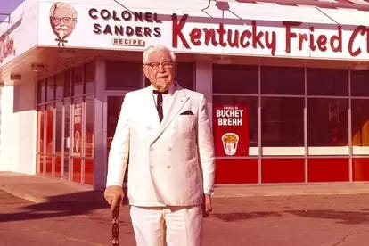
8. Colonel Sanders:
Harland Sanders had a tumultuous career marked by numerous brawls, a literal shootout with a competitor, business ventures, and several shifts in employment. Despite his roller coaster of tensions with others, in 1935, he was commissioned as a Kentucky Colonel, a title awarded for his local popularity. After bouncing through various failed ventures, he eventually found success franchising his fried chicken recipe, founding KFC, which grew into a global brand.
“Colonel Sanders” understood showmanship, distinctiveness, and consistency. He began leaning into his title of colonel in 1950 and began dressing as a “southern gentleman.” He wore the same outfit every day in public during the last 20 years of his life. He even dyed his mustache and goatee to match his hair.
Since his death in 1980, KFC has turned the real-life Colonel into a rotating brand mascot. His image has been repackaged as everything from a cartoon to a marketing gimmick, played by a revolving cast of celebrities—Jim Gaffigan, Ray Liotta, Jason Alexander, even Reba McEntire.
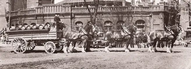
9. The Budweiser Clydesdales:
The original Budweiser Clydesdales came from Shea’s Brewery. August A. Busch Jr. bought them in 1933 after Shea’s had used them to promote their own beer.
Busch Jr. gave them to his father to mark the end of Prohibition. It started as a prank: Busch Jr. said he’d bought his father a car, then rolled up with a hitch of Clydesdales instead.
Hitched to a red, white, and gold wagon, they hauled the first case of post-Prohibition Budweiser through the streets of St. Louis. After that, the horses toured the country, delivering beer to President Roosevelt and Al Smith, the former New York governor who helped bring Prohibition down.
Today, the Budweiser Clydesdales show up at the Super Bowl as a distinctive asset that can actually carry emotion. Most brand assets can’t pull that off; they haven’t been around long enough or used consistently enough to earn it.
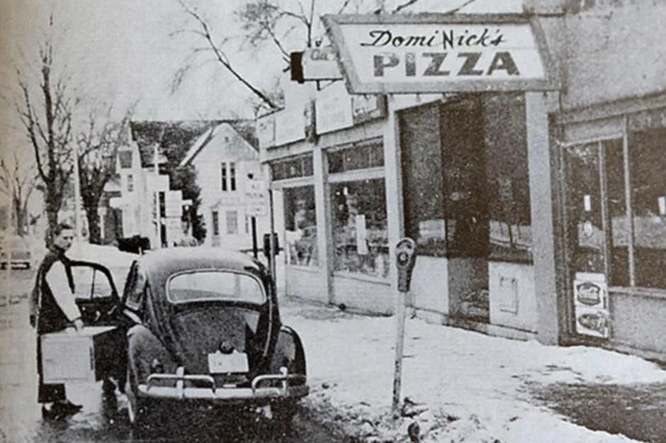
10. Dominos:
Domino’s Pizza experienced a fortuitous discovery when a delivery driver suggested the name “Domino's,” once the founder discovered the previous name, “Dominick’s,” had trademark issues.
11. Caterpillar:
The early steam tractors of the 1890s were heavy and their wheels would sink into the ground. One of the founders of Holt Manufacturing, Benjamin Holt, attempted to solve this problem by wrapping planks around the wheels. When company photographer Charles Clements commented that the machine looked like a caterpillar when viewed upside-down through his camera, Holt seized on the metaphor and the company was named.
Even though Caterpillar now goes by CAT—and most people will never need to buy construction equipment—the full name still lives in almost every American’s head.
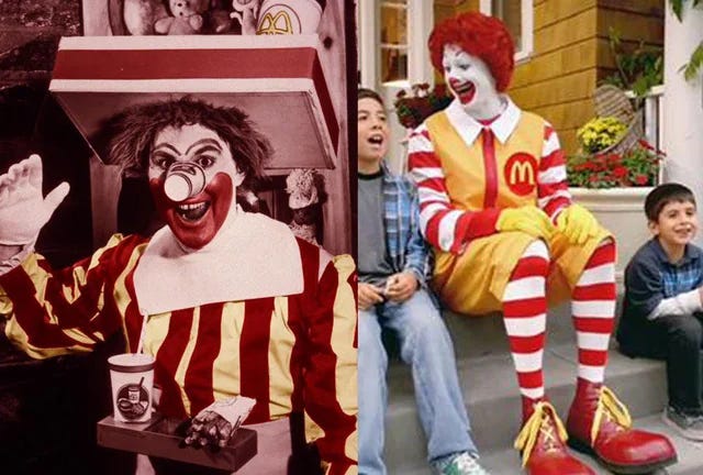
12. Ronald McDonald
In 1963, years after “Bozo” vanished from TV, Willard Scott—who played Bozo—introduced “Ronald McDonald, the Happy Hamburger Clown” in local D.C. spots.
The ads worked. Two years later, circus performer Coco the Clown reworked the look for the Macy’s Thanksgiving Day Parade and a spot during 1965’s equivalent of the Super Bowl.
Despite calls from childhood obesity groups to retire him, McDonald’s hasn’t budged. Hard to blame them. One survey found 96% of U.S. schoolchildren recognize Ronald.
13. The Duracell Bunny
You read that right. The Energizer Bunny started out as the Duracell Bunny.
From 1973 through the late ’80s, Duracell ran its “Drumming Bunny” (a different rendition of an elephant above) ads—then let the trademark lapse in 1988. Energizer swooped in with a parody, and the rest is branding history.*
*Just because Energizer swiped a distinctive brand asset doesn’t mean you can. Even when brands temporarily use a competitor’s assets to take shots, they usually end up boosting the other brand’s recall. Most people won’t catch the nuance. Best case, both brands—or the whole category—get a bump. Worst case, only the target does, especially if they’re much bigger. Energizer pulled it off because Duracell didn’t fight back, and Energizer had the advertising budget to keep the pink bunny front and center ever since.
Just five years after the last Duracell Bunny ad aired, Energizer gaslit the U.S. into forgetting Duracell ever had one. Their ads positioned the “Energizer Bunny” (a phrase they hammered) against a fake rival, SuperVolt—a thinly veiled stand-in for Duracell—that failed to launch a mascot.
Meanwhile, in the UK, Duracell never dropped the pink bunny…
In 1992, Duracell and Energizer split bunny rights: Energizer got the U.S., Duracell kept Europe. But in 2016, Energizer sued after spotting Duracell’s bunny on battery packs in U.S. stores—claiming Duracell was dodging the agreement by funneling in European stock. Duracell blamed rogue importers.
Lawyers have been tied up for thirty years over the rights to a pink bunny. That’s how valuable meaningless distinctiveness can be.
Also, can you imagine the Mandela Effect on people who have lived in the U.S. and Europe?
14. The Morton Salt Girl
What have you always seen in the image above? Just a girl in an umbrella?
Did you ever catch the most important detail? The salt pouring out behind her?
The Morton Salt girl was created to address a problem Morton uniquely solved: salt caking from humidity. In 1911, caking was a major issue until Morton added magnesium carbonate, an anti-caking agent. In 1914, when brainstorming for their first ad campaign, N.W. Ayer pitched several ideas, all of which were rejected. It was a backup idea that stuck—a girl in the rain with salt pouring out, paired with the slogan "When it rains, it pours." It emphasized that Morton Salt didn't cake, even in the rain.
Today, all salt brands add magnesium carbonate—another example showing that differentiation can't be "owned" for long. The girl no longer carries a message. She's become meaningless over time,* with most never noticing the salt pouring out.
*The same can be said for NBC’s Peacock which was first created to highlight NBC’s color TV. Once a visual representation of a differentiator, now just a bit of branding trivia.

15. Adidas (Name and Logos)
In 1924, Adolf and Rudolf Dassler opened a shoe shop: Gebrüder Dassler Schuhfabrik (“Dassler Brothers Shoe Factory”). They were the only company in the world making spiked shoes for athletes.
Despite being actual Nazi Party members (not what passes as a "Nazi" today), their business took off when Jesse Owens, a black track and field athlete, wore their shoes at the 1936 Olympics. However, in 1949, the brothers had a falling out and launched separate companies.
Adolf started Adidas. Why “Adidas”? Simple. Adolf’s nickname was “Adi,” and his last name started with “Das.” That’s it. No strategy decks. No naming consultants.
Rudolf, his brother, started Ruda (combining “Ru” and “Da”).
Ruda didn’t stick, however. A few months later, the company was renamed Puma.
The Adidas logo has a similar history of “Adi” Dassler making decisions somewhat randomly.
The original logo (shown above within the brown shapw) was an illustration of a shoe with three stripes. Why three? Adolf tested different stripe counts and found three showed up best in photos.*
*If you’ve read my article Design Has A Brand Strategy Problem, you’ll remember Paul Rand used the same practical considerations for the IBM logo.
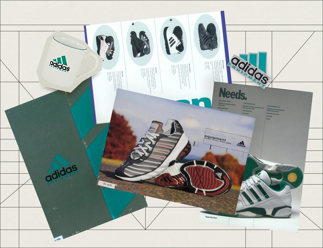
After dropping the shoe illustration, Adidas used a plain wordmark until 1972, when they expanded into clothing. That’s when the “trefoil” logo was introduced. It was floral-inspired while maintaining the same 3 lines from before.
In 1989, the “Equipment” logo was designed to reflect how the three stripes looked from inside an Adidas shoe.
So there it is. A nickname mashup, some basic visibility tests, and a dash of Nazi family drama; that’s the origin of Adidas’s meaningless name and logos.
16. Shell
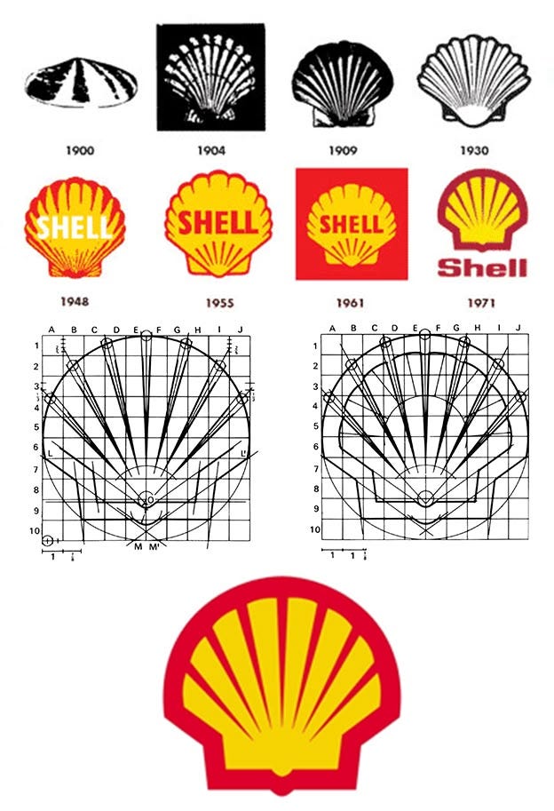
Before Shell became a global energy giant, it was built on—yes—seashells.
In 1833, Marcus Samuel sold antiques, then moved into oriental shells, which were trending in interior design. Demand grew so much he began importing them from the Far East.
Samuel never entered the energy business himself—he died in 1870. But his sons expanded his import/export seashell business into oil, commissioning the first tanker to pass through the Suez Canal, which changed the industry.
Standard Oil, their main competitor, sold kerosene in distinctive blue cans. To stand out, the Samuel brothers used red cans and renamed their father’s company “Shell.”*
*I wasn’t able to track down examples of the original cans, but I’d love to see them.
17. McDonald’s Arches
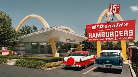
The Golden Arches weren’t born from deep symbolism or clever strategy; they were born from a desire to stand out.
Richard McDonald sketched two simple half-circle arches because he thought they’d be distinctive and visible. Several architects rejected the idea (they didn’t like the idea of their client pitching architecture ideas) before the brothers hired Stanley Meston, who—along with his assistant Charles Fish—turned the crude sketch into a sleek, modern design.
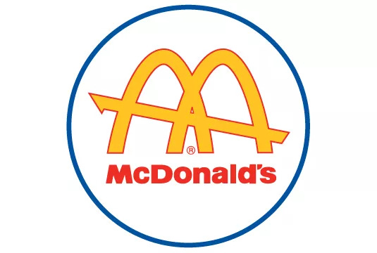
Later, McDonald’s head of design noticed that when viewed at an angle, the structural arches vaguely resembled the letter “M.” That visual coincidence became the logo in 1962.
Marketers love to slap meaning onto brand assets that were really just designed to get noticed. The Golden Arches are a prime example.
When McDonald's considered removing them, marketing consultant Louis Cheskin argued they had to stay—not because they were distinctive and had already won hard-earned recognition, but because of his own research on their Freudian appeal. Cheskin compared them to "mother McDonald's breasts," suggesting their subconscious connection to breasts symbolized homemade food.
Designers love to apply psychology to McDonald’s, too. Despite zero evidence that color psychology influenced their choice of red and yellow, design influencers insist McDonald’s colors were picked to spark appetite or excitement.
It’s the same old story: marketers and designers make up complex psychological meanings for brand assets that were never meant to carry any.
18. KitKat
Mark Ritson uses KitKat to illustrate his concept of “relative differentiation”—the idea that brands can appear more differentiated from competitors, even if their differentiators aren’t truly unique. To make his point, he often highlights KitKat’s relentless marketing, positioning itself as the snack for “taking a break.”
I think there are far better examples Ritson could use to illustrate his point than KitKat.
Ritson is right that KitKat has attempted to differentiate themselves in this way. KitKat was originally created for workers at the Rowntree factory,. The bar was designed as a quick, convenient treat during breaks. The two-finger design, perfect for breaking in half, made it shareable and practical. Over time, the brand reinforced the "break" messaging in its advertising, tying KitKat to moments of rest.
But here’s the thing: I’m not convinced most consumers connect KitKat with “taking a break.” It’s more likely they think of it as “breaking chocolate apart.”
This is where the line between relative differentiation and meaningless distinctiveness can blur. KitKat’s breakable design is distinctive, but does it still carry the original “rest” meaning, or is it just a quirky, memorable feature with no real practical use?
I’d love to see some research on this. Although I’m not sure you could isolate the effect—ask people which brand reminds them of “taking a break” and they'll likely say KitKat, primed by the jingle and the physical act of snapping it apart, even if they’d never made the association before.
I’m also doubtful that saving part of your KitKat for later or sharing it is a real differentiator. Sure, some people might do it, but does it drive purchases? To me, KitKat is just another option for “tasty chocolate with a crispy texture,” like Twix or Crunch bars. The main differences? Ingredients and slight texture variations.
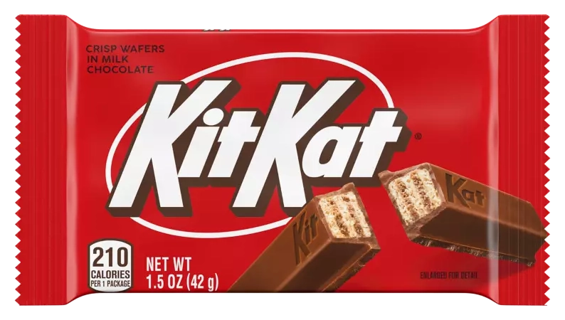
What stands out to me most is KitKat’s distinctiveness—its red packaging, unique shape, name, and that jingle.*
Then again, maybe I’m wrong. Maybe people do choose KitKat for “taking breaks” or sharing. All I know is the few friends I’ve asked about it have never made that connection.
*Speaking of which, they really need to bring the jingle back. Their current generic approach is far less sticky. I believe the iconic jingle does less to reinforce the “taking a break” idea and more to boost the chocolate’s distinctiveness—its texture, split design, and the act of breaking it apart. The jingle also reinforces the KitKat name far more than their current campaigns. It locks the brand name into the melody, making it instantly recognizable by sound alone—even The Office riffed on how stuck-in-your-head the KitKat name gets.
19: The Elmer’s Glue Bull
Got glue? Borden, a dairy company, did in 1951.
Why would a dairy company start making glue? Early glue used casein—the same protein found in milk. It wasn’t completely out of nowhere. Neither was Elmer the Bull.
Gail Borden had already reshaped the dairy industry in the 1800s by inventing the first commercial method for condensing milk. After his death, the New York Condensed Milk Company—later renamed Borden—pioneered glass bottles for liquid milk.
Then came the buying spree. Riding the success of their condensed milk, Borden bought 200 companies in three years. These days, at least in Wisconsin where I live, Borden’s mostly still known for its condensed milk. You can find their liquid milk in some U.S. stores, but in the 1940s, Borden was the name in milk.
Elsie the Cow debuted in 1936. Today, a cow mascot would disappear into the noise—cows are the default for dairy. But in the 1930s and ’40s, there weren’t many dairy mascots, so Elsie had the space to stand out. The yellow flowers around her neck helped, sure, but she worked because Borden pushed her hard. They turned her into a national campaign—billboards, magazines, parades—and even gave her a husband.
Elmer started as a background character in Borden’s milk ads—usually fixing things around the house. When Borden launched a chemical division, they saw what Elsie had done for their milk and reused the playbook. Elmer became the mascot. When they rolled out their glue, they named it after him.
Unlike Elsie, Elmer had no built-in relevance to its category. He only made sense because of his connection with Borden milk and marriage to Elsie. And that’s exactly why he worked.
If Borden milk and Elmer’s Glue launched today, Elsie would blend in. Elmer wouldn’t.
20. Liberty Mutual’s Limu Emu & Doug
So far, we’ve looked at “meaningless” brand assets that were born with meaning—then lost it over time.
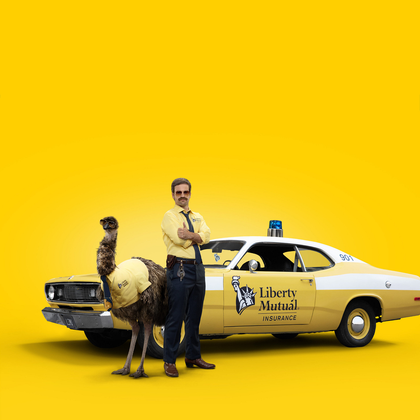
Let’s end with one that started meaningless on purpose: Limu Emu & Doug.
The campaign came from Goodby Silverstein & Partners—the same agency behind “Got Milk?” According to Liberty Mutual’s CMO Jenna Lebel, the emu and his human sidekick were one of a dozen random ideas. “We were truly open to all types of spokescharacters during the exploration phase of campaign development.” Other ideas included a talking pigeon in yellow pants and a misunderstood T. rex trying to live a normal life. Limu Emu & Doug just happened to test better.
“Limu” is short for Liberty Mutual. “Emu” rhymed. “Doug” was picked from a name list. That’s about as far as the strategy went. Sure, there’s a loose concept—the two act like crime-fighting partners, and the crime is overpaying for car insurance—but the idea wasn’t born from some deep brand framework. It came from creative instinct.
Since their debut during COVID, Limu and Doug have spun off side characters, like the “Liberty Biberty” guy—played by a real-life soap star who first appeared in a spot where he botched Doug’s lines while auditioning to steal his role. Now he has his own campaign where he corrects a toddler who says “Liberty” correctly—by insisting, “No, it’s Biberty.” That campaign drops the “Liberty Biberty” guy into the same setup Liberty Mutual’s been using for over a decade—actors delivering flat, generic testimonies pretending to relate to what we’re going through, all set in front of the Statue of Liberty. It might not be the funniest ad, but it’s certainly an improvement.
The insurance industry’s been riding the randomness wave ever since Geico accidentally struck gold with the Gecko in the late ’90s. Since then: Flo, The General, the Aflac Duck. Even Geico couldn’t help themselves—they followed the Gecko with cavemen and a camel yelling “Hump Day.”
None of these mascots are tied to insurance—or to anything people typically associate with it: safety, preparedness, fear, accidents, service. And that’s exactly why they work.
Conclusion
Meaningless distinctiveness stands the test of time. These names and assets—whether logos, jingles, package shapes, or mascots—are disconnected from the category they represent, making them harder to imitate, even inadvertently.
Most were created with intent. But today, customers don’t notice or care. Whatever meaning they once had is long gone.
And that’s why they work.


