

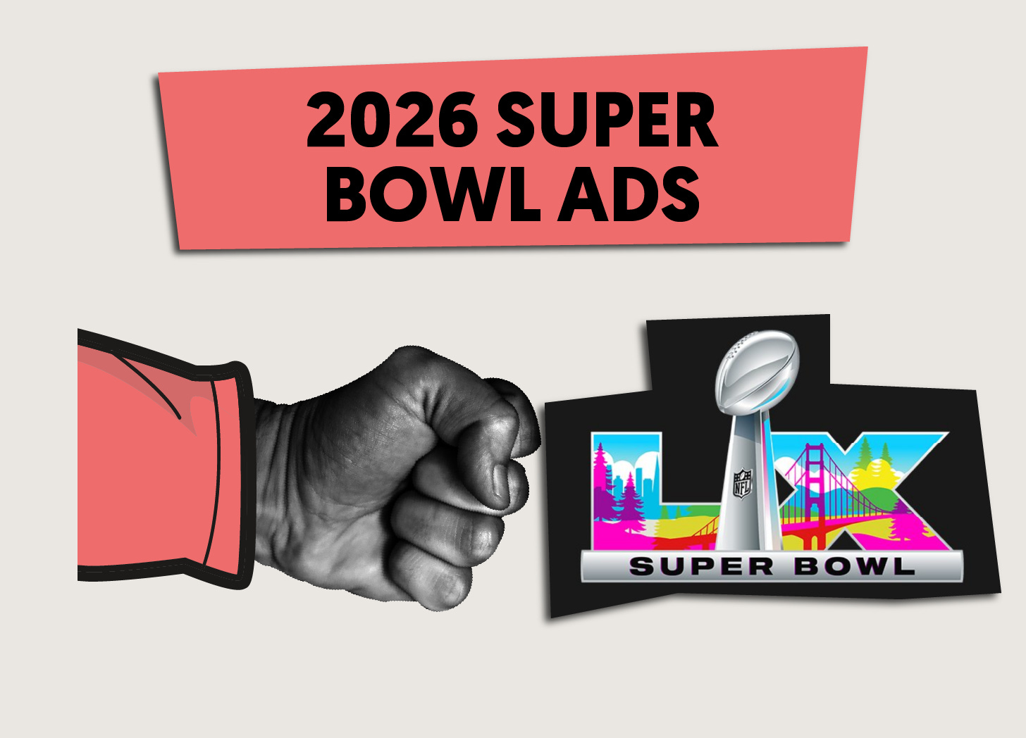
2026 Super Bowl Ads - Winners and Losers
My controversial picks for the best and worst Super Bowl ads of this year.

For anyone new here, I’m the founder of Woo Punch, a brand design studio rooted in marketing science.
I name brands and design identities (including logos, brand mascots, taglines, colors, sonic logos, and other fluent devices).
The Super Bowl Myth
The most effective Super Bowl ads are clever, emotional, funny, and inspirational.
We’ve all bought into this myth. But does it hold true, considering what we’ve learned about consumer behavior from marketing science, behavioral science, and advertising psychology? Was 2011’s VW ad “The Force” effective at selling VWs? Or is the forgettable Nerds ad from this year a better (and more realistic) standard for advertisers to aspire to?
Which ads will help the brands being advertised sell products, and which ads might simply help the creative agencies behind them win awards?
Why My Rankings Are Different
Most Super Bowl ad rankings are popularity contests or pretested audience reactions. Both have a fundamental flaw: they don’t account for memory decay or measure real-world distracted viewing.
Most consumers are distracted and most advertising gets immediately forgotten. But that doesn’t mean the brand will be forgotten. Familiarity matters. Every exposure makes a brand more familiar, and we’re heavily biased toward familiar brands.
The best way to succeed with a Super Bowl ad is to: 1) be distinctive, 2) back that ad with years of consistent exposure before and after, and/or 3) employ a gimmick that might win short-term but fizzle out quickly.
My rating system is heavily weighted toward distinctiveness and consistency.
It’s not a perfect system, however. My rankings are subjective—based on whether brands have consistently advertised to me and whether they’re distinctive to me. But I might have a superpower that gets me closer to the average consumer’s experience: my ADHD. I rarely pick up on messaging and my attention is constantly elsewhere when experiencing advertising.
To reach me, a brand can’t just be relatively distinctive—it has to be Category-Defiant. A brand can’t just be consistent—it has to saturate my world.
Brands must “design for the extremes” to stand out for distracted brains like mine and, by doing so, meet everyone’s distracted brains. That’s why I place such a high premium on brand distinctiveness and consistency when evaluating the Super Bowl lineup.
Brands Waste Millions When They’re Not Distinctive
Brands spend millions on Super Bowl ads. Most of that spend is wasted—not because Super Bowl ads are poor investments, but because brands either don’t have a consistent presence in our lives or don’t stand out among competitors.
That’s why I pursue Category-Defiant Distinctiveness when naming brands and designing identities. I actively gather competitor assets and advertising, then do as close to the opposite as possible without confusing or isolating light buyers. This includes logos, brand mascots, taglines, colors, sonic logos, and other fluent devices.
For many brands that advertised this year, their hands are tied. It’s too late to overhaul their identity. But your brand could be different. If you’re launching a new brand or product, or strengthening your current brand, reach out.
I name brands and design identities (including logos, brand mascots, taglines, colors, sonic logos, and other fluent devices).
How I Grade Super Bowl Ads
Below is the explanation for my rating system. If you would like to skip ahead to the rankings, scroll past my 5 Keys.
The 5 Keys to an Effective Super Bowl Ad
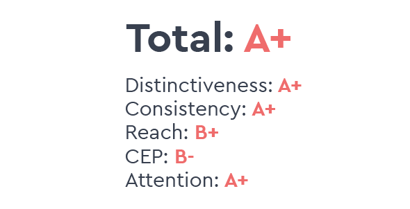
I believe there are 5 keys to an effective ad based on the Ehrenberg-Bass Institute’s research into marketing effectiveness, Nobel Prize winner Daniel Kahneman’s research into behavioral science, and Robert Heath’s research into the psychology of advertising. These 5 keys are Distinctiveness, Consistency, Broad-Reach, Category Entry Points, and Attention.
Certainly, other factors can go into whether or not an ad is effective, but the following 5 keys should be the primary objectives of any effective ad.
Each key is not created equal so I gave them different weights. For example, if a Super Bowl ad is clever and funny (scores well in Attention), but the brand being advertised is lost in the mix (scores poorly in Distinctiveness), that ad will have a lower grade than a boring but well-branded ad. That’s because Distinctiveness is far more important than Attention.
You can read more detail about these keys in my Super Bowl article from 2022 but I will summarize them here.
To grade this year’s ads, as always, I assigned the following percentages to each key:
DISTINCTIVENESS - 65%
The first key factor for an effective Super Bowl ad is distinctiveness, and I estimate that distinctiveness accounts for up to 65% of an ad’s effectiveness. If an ad isn't strongly linked to the brand being advertised throughout using distinctive audio, thematic, and visual cues, it will essentially be a waste of money. We won’t know who was advertised.
Despite this, many brands sacrifice these cues in favor of emotional narratives, virtue signaling, or humor. Advertisers often treat ads like short films aimed at winning creative awards, not tools to sell products. This is a mistake.
CONSISTENCY - 20%
The second biggest factor for an effective Super Bowl ad is consistency. I estimate consistency accounts for up to 20% of an ad's effectiveness.
If the brand being advertised has never been advertised before, or the brand has consistently advertised, but its Super Bowl ad is dramatically different from all of its other ads, consumers will find it hard to link the ad to its correct brand.
BROAD-REACH - 8%
The third factor is broad-reach. As a whole, broad-reach is more important than consistency and sometimes even distinctiveness. I estimate that broad-reaching advertising channels account for as much as 80% of advertising effectiveness in some cases. But here, I'm grading content, not advertising channels.
As a result, I estimate that broad-reaching messaging or content accounts for around 8% of a Super Bowl ad's effectiveness relative to all other key factors. Instead of catering to a specific demographic or psychographic, Super Bowl ads should target all category buyers with their messaging and content.
CATEGORY ENTRY POINTS (CEPs) - 5%
The 4th most significant factor for an effective ad is Category Entry Points (CEPs).
Rather than differentiating your brand, you should try to tap into why consumers buy from your category in the first place before they even consider brands. Most consumers don’t perceive the differences between brands. Therefore, while differentiation can be effective for niche brands targeting heavy category buyers looking for additional customization, it's costly to establish a differentiator among distracted buyers who are the key to long-term growth. By prioritizing CEPs the goal is to simply be considered in various buying situations.
Again, I explain this in more detail in my 2022 article.
While CEPs are extremely helpful, they take a lot of time and repetition to build. Because of this, I'm grading individual ads here without considering a brand's overall advertising, so I estimate CEPs account for around 5% of an ad’s effectiveness during stand-alone Super Bowl ads.
ATTENTION - 2%
Finally, attention is the least important (but still critical) key to an effective ad.
While marketing gurus and the general public think attention is the most essential key for a Super Bowl ad, attention is complicated and misunderstood. There are several types of attention and not all are good when it comes to advertising. High attention can even have a negative effect on sales. I estimate that attention accounts for around 2% of Super Bowl ad effectiveness.
My estimates for each key aren't an exact science, and there are additional keys that can be helpful that I don't discuss here, but I wanted to grade these ads on the most critical factors.
My Grades for This Year’s Super Bowl Ads
MY TOP 5 BEST

Strengths:
Dunkin’ has been killing it the last several years at the Super Bowl, making my Top 5 three years in a row.
Weaknesses:
Celebrities are a high-risk gamble. You can’t control their personal lives, their next controversy, or—most importantly—their loyalty to other brands. However, if you’re going to play the game, follow the Dunkin’ playbook: Total brand saturation. If your brand identity isn’t strong enough to pair with a celebrity's image, you have a bigger problem. If that’s the case, let’s talk.

Strengths:
Pringles benefits from a highly recognizable product shape and distinctive tube packaging.
In this Super Bowl ad, Pringles seamlessly incorporates their distinctive tube and product shape into the storyline.
Pringles has also frequently made my Top 5 list.
Weaknesses:
Unlike previous Pringles Super Bowl appearances where someone’s hand gets stuck in a Pringles tube at a party—demonstrating the category entry point of “a snack for a party”—there is no category entry point on display here.
Sabrina Carpenter is somewhat controversial. She illustrates the issue with celebrities: you can’t control their brand image.


Strengths:
There is no mistaking the T-Mobile brand here. It’s an explosion of pink.
T-Mobile has been ratcheting up their ad spend significantly over the last few years.
Weaknesses:
For the record, I hate NSYNC and don’t even have the time to look up if this ad featured NSYNC or the Backstreet Boys. I know many others like me, so I punished them slightly for not including a 90s band that was more universally loved.

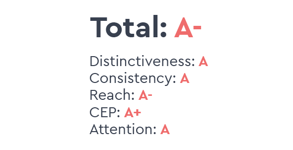
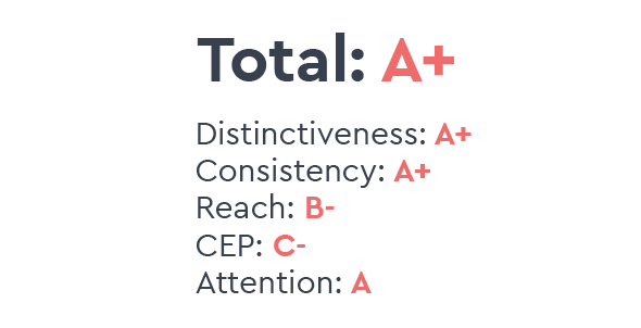
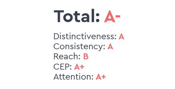
Strengths:
Most of the ad takes place within Gemini’s interface. This is a significant deviation from every other AI ad we saw this year. This was likely a strategic choice to remain consistent with historic Google ads, but it doubles as a trick to eliminate the "brand desert" often created when storytelling takes precedence over the product. This was Claude’s fatal trade-off. Despite possessing an unusually strong differentiator and the most distinctive brand in the space, the execution missed the mark. Hence the D+ in this list; great branding and differentiation is wasted if the audience can't find the brand. But at least they didn’t get a D- like OpenAI or an F- like GenSpark.
Google’s more distinctive color scheme, where Google Photos is present throughout, makes up for Gemini’s generic branding.
Leave it to Google to turn a technology with significant societal downside personal. It almost makes you forget that so many people are using AI to avoid personal contact at all costs.
Weaknesses:
Gemini’s logo lacks true distinctiveness. In fact, its near-identity to GenSpark’s logo is precisely why the latter landed in my Top 5 Worst rankings this year. This is a shared failure: when AI is intuitively linked to space, stars become “category-natural” clichés. Combined with heavy gradients—another industry trope—the brand loses its edge. Gemini only recovers by leaning into Google’s broader ecosystem; their recent shift from a blue-to-purple gradient to Google’s iconic color palette was a necessary move to reclaim brand equity. If you want to build a brand that competitors can't easily mimic, let’s talk.

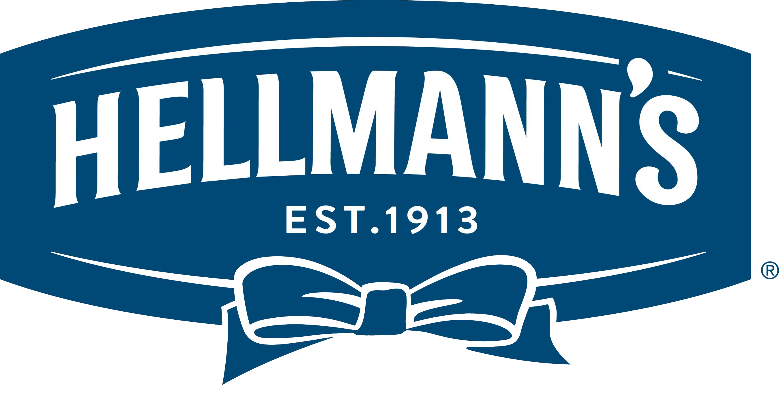
Strengths:
This ad gets viewers to look up and the Hellmann’s brand is rarely missing throughout.
Weaknesses:
There is a particular brand of humor here that isn’t everyone’s favorite. There is also something unappetizing about mayo being squirted out of a bottle by a stranger at a diner.
MY TOP 5 WORST


Strengths:
It could be worse. It's not actively bad. It’s just actively mediocre.
Spectrum’s ad won’t alienate any audiences.
Weaknesses:
Spectrum continues its trend of “safe” advertising, resulting in a spot that is the definition of a category cliché. Except, hiding your brand isn’t safe.
Brand building isn’t about overt emotion. It’s about covert emotion. Don’t tell us why we should like you. Entertain us or make us quietly feel something without realizing it.


Strengths:
It won’t turn anyone off, other than those expecting at least some level of entertainment in a Super Bowl ad.
There is a strong category entry point: get tested so you can prevent unknown health issues.
Weaknesses:
Was there a secret competition I missed? Which brand can disappear most completely? You can’t just throw a couple of celebrities into an ad and expect it to work like a magic pill. You have to at least try to tell the audience who you are.

Strengths:
They chose a universally liked celebrity.
The brand name was spoken throughout.
There was a very strong category entry point: use AI to save time at work.
Weaknesses:
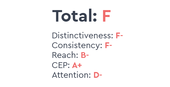
GenSpark entered the Super Bowl conversation with no prior brand equity. The lack of reach and total absence from PR channels meant the ad had to do all the heavy lifting for a brand that, until last night, simply didn't exist in the public consciousness as far as I’m aware.
Watching this live, I was genuinely baffled. I was convinced I was seeing a new Gemini product launch. Why? Because they straight-up stole Gemini’s logo. Between a name that also starts with "Ge" and the recycled aesthetic, it’s a perfect case study in how uninspired AI branding is and why it’s so important to invest in a Category-Defiant brand. It turns out there is one thing AI can’t generate: distinctiveness. GenSpark’s creators clearly missed the memo: you’re supposed to pretend AI can design a brand from scratch, not actually let it do it.

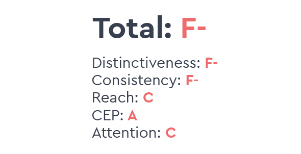
Strengths:
The ad certainly grabs your attention in an era when advertising is cluttered with neons, bright lights, and epilepsy-induced cuts.
Weaknesses:
Coinbase is a repeat offender. They first hit my Top 5 Worst list in 2022 with their cryptic QR code stunt, and they clearly haven’t learned their lesson. They continue to prioritize “the gimmick” over the brand, failing to realize that if the audience doesn't know who’s advertising, the millions spent on airtime are essentially a donation to the entire crypto industry.

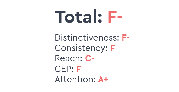
Strengths:
The ad grabs your attention.
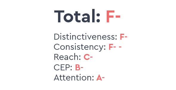
It’s clearly linked to sports betting.
Kendall Jenner is widely unliked, but she’s not necessarily loathed.
Weaknesses:
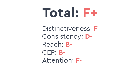
I did a double-take on this one. When I saw an “F” logo flash over my screen at the beginning, I assumed it was a FanDuel ad. It wasn’t until the end when I realized, “Oh they didn’t say FanDuel, they said Fanatics. Wait, isn’t that a clothing company?”
Look. Just because you own a sports apparel company does not mean you can pivot entirely into gambling without warning. Apparel and gambling are, in fact, two very different things. One ensures you are fully clothed while representing your favorite team. The other will ruin your life. You have to prime people first before you jump into an entirely different category. Hence, the F- - for consistency.
I name brands and design identities (including logos, brand mascots, taglines, colors, sonic logos, and other fluent devices).
All Grades:
Pringles: A+
T-Mobile: A+
Dunkin: A+
Gemini: A
Hellman's: A
Nerds: A-
Bud Light: A-
Ritz: A-
Budweiser: A-
Ritz: A-
Instacart: A-
Levi's: A-
Michelob Ultra: A-
Liquid Death: B+
Ro: B+
Kellog's: B+
Kinder Bueno: B+
Uber Eats: B
Apartment & Homes.com: B
Xfinity: B-
Toyota: B-
Poppi: B-
TurboTax: B-
Ring: B-
Bosch: B-
VW B-
Oikos: B-
Salesforce: B-
Pepsi: C+
State Farm: C+
Hims & Hers: C+
Novartis: C+
Wegovy: C+
Wix: C
Dove: C
Lay's: C
Manscaped: C-
Liquid IV: C-
Pokemon: C-
Oakley/Meta: C-
Squarespace: C-
Cadillac: D+
GrubHub: D+
Claude: D+
Blue Square Alliance: D
Alexa: D
United/Starlink: D-
ChatGPT: D-
Redfin: D-
He Gets Us: D-
Spectrum: F+
Boehringer: F
GenSpark: F-
Coinbase: F-
Fanatics Sportsbook: F-
This grading system is brilliant — “Category-Defiant Distinctiveness” cuts through the Super Bowl myth like a knife, showing how Pringles/Dunkin’ dominate by owning every frame while GenSpark vanishes in plain sight.