Good Brand - State Farm
State Farm has read the evidence regarding the importance of distinctiveness in advertising.
For anyone new here, I’m the founder of Woo Punch, a brand consultancy rooted in evidence-based brand design. I write about the evidence that debunks brand purpose, differentiation, brand love, loyalty marketing, customer personas, color psychology, mission statements, customer engagement, AdTech, and “hustle culture.”
Want to chat about your brand? Schedule a free intro call.
About State Farm
Believe it or not, State Farm Insurance has been around since 1922.
Originally State Farm was a niche insurance brand for, you guessed it, farmers. Today, State Farm is the largest auto insurance provider in the U.S., commanding a 15% market share.
State Farm used to rely on customers and their families sticking with their services throughout generations. But, in the late 1990s, Geico challenged the status quo and turned the auto insurance industry into more of a commodity market than a service market. Customers began switching between providers more easily.
State Farm could no longer rely on customers to stay with them for life. To keep up with Geico, State Farm needed to prioritize customer acquisition over customer retention to maintain its market share. They needed to consistently advertise a distinctive brand using mass media channels to do this.
Have they been successful? Oh, yea.
GOOD BRAND CHECKLIST
#1 IS THE STATE FARM BRAND DISTINCT?
In the 1980s, State Farm was relatively distinct compared to its competitors. Now? It’s physically impossible to mistake State Farm for anyone else. Let’s look at the evolution of State Farm’s brand over the years.
There are 3 relatively strong distinctive assets featured in this ad from 1987.
Their distinctive logo.
Their distinctive color scheme (although they have a standard color scheme in red and white, at the time, they were the only ones using those colors).
Their jingle (which had a distinct melody but not a distinctive song style).
However, their most recent ad has taken these assets to a new level!
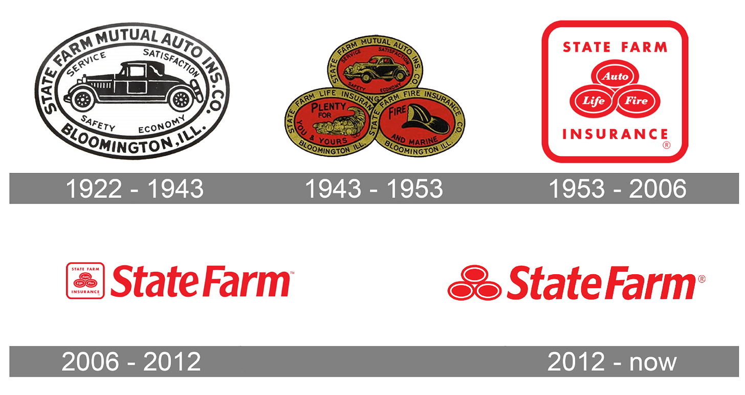
First, in 2012, State Farm refreshed its logo. While their original logo was distinct, the redesign allowed them to scale down for digital mediums. Whether this was planned or not, the logo refresh simplified the logo, making it even more distinct than it was.
Second, they leaned into their color scheme.
As you can see in the 1987 ad, State Farm incorporated red inherently by featuring their logo and subtly in the end with the tagline banner.
However, in this year’s ad, you see an explosion of red. The opening logo animation is red; they are surrounded by red walls and floors, and “Jake from State Farm” is even wearing red sweats.
Moving on to audio.
State Farm brilliantly found a way to revive its iconic jingle (which was written way back in 1970) for the 21st century.
Jingles have always been very effective, but jingles became dated when every brand used them from the 50s to the early 2000s. So state Farm found a way to use their classic jingle while still being relevant.
Finally, as if a distinctive logo, distinctive color scheme, and distinctive jingle weren’t enough, State Farm has now even added a distinct character in “Jake from State Farm.”
There is no question. State Farm is distinctive.
#2 IS THE STATE FARM BRAND SIMPLE?
As I mentioned before, State Farm refreshed its logo in 2012. So, what significant change did they make? They simplified it, of course!
#3 IS THE STATE FARM BRAND CONSISTENT?
Oh man, is it!
For one, the brand’s core had hardly changed since 1943 when they landed on the bones of their current logo highlighted in red. Second, if you’re TV viewing habits are anything like mine, you almost exclusively see State Farm ads on TV, whether on ad-supported streaming platforms or live TV.
#4 IS THE STATE FARM BRAND TIMELESS?
You can easily see design trends in State Farm’s original two logos in 1922 and 1943. However, their 1953 version could easily exist today without most people batting an eye (except designers, of course).
The 1953 design didn't suffer too much from looking outdated; it suffered from logistical issues. First, the confines of the bubbles' words prevented State Farm from expanding beyond Auto, Life, and Fire insurance, and second, it wasn't easily scalable on digital platforms.
In terms of advertising, while many of the creative choices State Farm has made in their recent ads might look dated, in 20 years, the bones of the brand won't. That's what you want. A brand that can creatively adapt to the times without losing its distinctiveness.
Their logo should always work, their color scheme is simple enough, and the basic melody of their jingle or even the lyrics of that jingle (now spoken) should never go out of fashion.
#5 IS THE STATE FARM BRAND DYNAMIC?
Does the brand work without the name or logo?
Let’s see...
I can tell it’s State Farm. Can you?


